Branded QR codes can attract significantly more attention and scans. By adding brand design elements to a QR code, you make it more visible and increase user trust. Studies show that beautifully designed QR codes with a brand logo are scanned up to 80% more often than standard black and white ones. Higher CTR means more audience engagement. In addition, a branded QR code increases recognition and creates a positive perception of the brand. The ViralQR editorial team will explain how the design of a QR code, its colors, logo, module shape, and overall structure affect scanning rates and user trust. We will also consider 9 best practices for creating effective branded QR codes.
Why QR code branding matters?
A branded QR code is an extension of your brand identity. While a regular QR code may seem like a faceless piece of tech, a branded code immediately communicates your company. For example, a logo in the center of a QR code reinforces brand recognition and makes the code more attractive to scan, while also increasing trust. This way, the user sees that the code comes from an official source and is not a phishing scam.
A branded code stands out from the crowd and attracts more views. According to ViralQR, a branded QR code generates more interest and trust, while a faceless black square can get lost or even scare off the user. In other words, a little design effort turns the QR code into part of your marketing story, which increases engagement.
It’s also important to note that branded QR codes work as advertisements in their own right. Even without scanning the code, people see your logo or brand colors, boosting recognition. In comparison, a faceless code without any prompts may go unnoticed. So, branding your QR code matters because it both increases CTR and improves your brand perception. Below, we’ll look at the key differences between a typical QR code and a branded one, and then move on to practical design tips.
Default vs Branded QR: Comparison Table
For clarity, let’s compare a regular “default” QR and a customized branded one:
| Characteristic | Standard QR Code (default) | Branded QR Code (customized) |
|---|---|---|
| Appearance | Black-and-white grid of squares with no additional design; looks generic and easy to overlook. | Brand colors, logo, and unique patterns are integral to the brand identity and draw more attention. |
| Brand recognition | None: looks the same as any other QR code. | Includes brand elements (logo, palette), immediately associates with the brand, and increases recognition. |
| Trust & perception | May be perceived as generic or suspicious; easy to ignore. | Looks official and inspires more trust thanks to familiar style and logo; more likely to be scanned. |
| Engagement (scans) | Lower likelihood of scanning: monochrome code blends into surroundings and doesn’t stand out. | Higher scan conversion (CTR): noticeable design and CTA prompt action; more organic scans. |
| Integration into design | Often looks like a ‘foreign’ element tacked on at the end of the layout. | Integrates organically with the medium: colors, shapes, and frame align with the layout; enhances rather than clashes. |
As you can see, QR code customization provides tangible benefits. Branded codes both look more attractive and work more effectively: more people will notice and scan your code, and your brand will receive a positive impression. Now, let’s move on to specific recommendations on how to achieve this.
9 Best Practices for Designing Effective Branded QR Codes
Below are 9 best practices for designing and using branded QR codes. Follow these tips to make your QR codes both effective and stylish without sacrificing scannability.
1. Design your QR code in your own style
Start by integrating your brand into the QR code itself. Use your company colors, fonts (if there is text around it), and other visual elements that match your identity. The QR code doesn’t have to be black. You can color the “pixels” of the code in your corporate colors or add a background that is associated with your brand. The main thing is to make the code part of the overall design of the advertising medium, and not an alien square.
For example, if your brand uses blue and orange colors, try making the QR code blue on a white background and adding an orange frame around it. A branded code will attract more attention and subconsciously tell the user that it leads to your content. The experience of many companies confirms the effectiveness of this approach. Branded QR codes of Unilever, Pepsi, and other brands have been successfully used in campaigns, emphasizing the unity of the code with the brand’s visual style.

2. Add a logo, but don’t overdo it with the size
Placing your company logo inside a QR code is one of the most popular ways of branding. A logo in the center of the code is immediately eye-catching and inspires trust: the user sees a familiar sign and is more willing to scan the code. However, it is important to maintain the right balance between logo size and scannability.
Follow the rule: the logo should occupy no more than ~20-30% of the QR code area. If you make it too large, it will cover too many modules (dots) of the code, and the scanner will not be able to read the information. Modern QR codes support a high level of error correction (Level H), which allows you to “cover” up to 30% of the code with the logo without losing readability. However, this limit does not mean that you need to use all 30%. The smaller and simpler the logo, the better for reliable reading.
| ECC Level | Max. theoretical data “closure” | Safe logo size | Note |
|---|---|---|---|
| L | ~7% | ≤10% of code area | Minimum margin for errors; complex logos are not recommended. |
| M | ~15% | 10–15% of the code area | Balance between branding and scanning stability. |
| Q | ~25% | 12–18% of the code area | Suitable for logos with simple shapes. |
| H | ~30% | 15–20% of the code area | Optimum for a centered logo; testing is still required. |
Practical advice: use simple logo shapes. If your logo is very complex (contains small details, thin lines, a lot of text), consider a simplified version of it specifically for QR codes. A logo that is too complex or multi-colored can become blurry when scaled down, making it difficult to scan. Choose a minimalist version, like a sign without a slogan, and place it in the center of the code. The image format also matters: use PNG or SVG with a transparent background to insert the logo to avoid a white square around it. SVG (vector format) is ideal, as it scales without loss of quality, so when exporting the QR code at a large size, the logo will remain clear.
Finally, place the logo carefully: it is usually placed in the center of the QR code. Most generators automatically insert the logo exactly in the center and do not touch the corner “eyes” of the code (the three large squares in the corners), which are necessary for QR recognition. Following these rules ensures that the logo decorates your code, but does not interfere with its functionality.
3. Provide high color contrast
Color is an excellent branding tool for a QR code, but use it wisely. The contrast between the code elements and the background should be maximum. This is a key condition for fast scanning: scanners (smartphone cameras) read the code best when the dark elements are clearly separated from the light background. The classic example of black squares on a white background was deliberately chosen for its ideal contrast. If you want to use corporate colors, make sure that the dark parts of the code are dark enough.
The main rule: dark code on a light background. Not vice versa! Never make light dots on a dark background. Many phones may not recognize the “inverted” code. For example, yellow or light pastel squares on a white background are a bad idea, because the scanner will not see them. It is better to use saturated shades of your brand for the modules themselves, and leave the background white or very light. If your brand has a light color palette (e.g., yellow, light blue), consider adding a stroke or shadow, making the background even lighter, and the code a little darker than the primary corporate color.
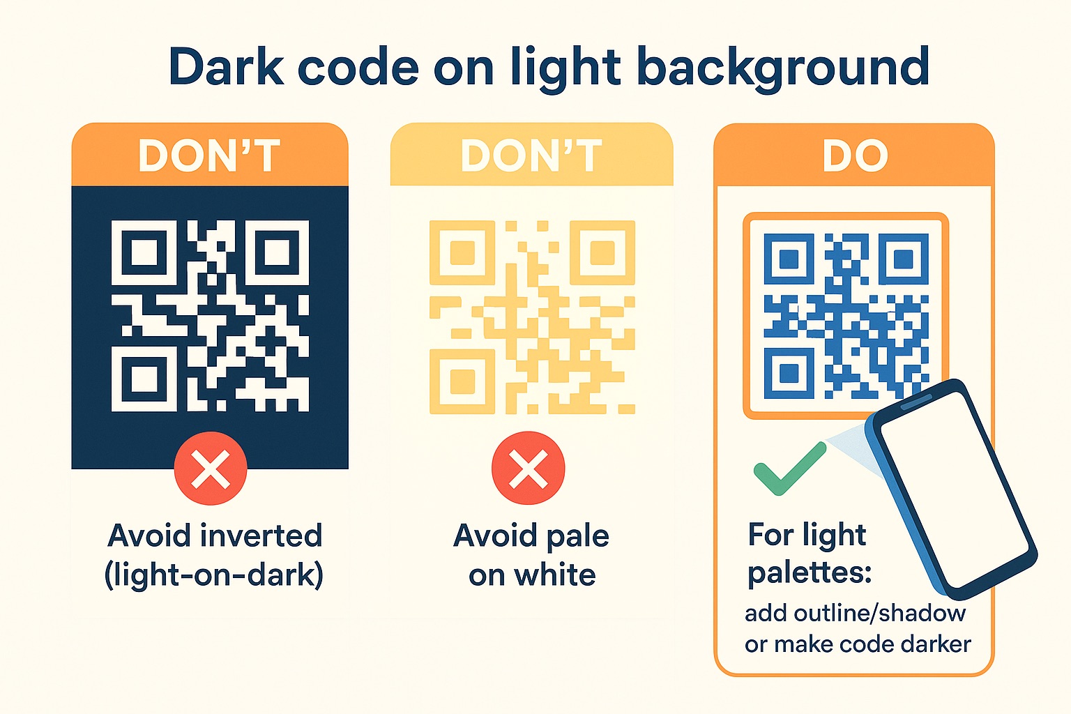
You should also not make the code completely multi-colored “in the rainbow”. First, this can reduce the contrast between neighboring elements. Second, a colorful code is harder to recognize as a QR and can look “noisy”. It is better to stick to two or three colors: say, the main color for modules, a secondary one for corner elements, and a neutral light background. Mono-tone or duo-tone solutions (one color for the code + background) are generally the most reliable.
Fortunately, most QR code generation services help you choose safe combinations. For example, the ViralQR tool will tell you if the contrast is insufficient. The service warns if the selected color is too light and advises to darken it. Remember: contrast = scannability. A bright branded QR code must remain technically readable, and the right choice of colors contributes to this.
4. Experiment with the shape of modules and code “eyes”
In addition to color, you can customize the shape of the QR code elements. Standard QR codes consist of small squares (pixels) and square corners. However, modern generators allow you to change this pattern: replace the squares with circles, hexagons, stars, or other shapes, and make the corners (“eyes”) round, with rounded frames, triangular, etc. Custom patterns help make the code unique and stylish, even more relevant to the brand. For example, if the company logo has rounded shapes, a QR code with round dots instead of squares will look appropriate.
However, it is important not to cross the line where creativity will harm functionality. There are several rules when changing the shape of QR code modules:
- Maintain readability. The user should still be able to see the QR code in front of them. If the elements become too intricate (for example, logos instead of each dot), the person may not understand that it is a QR and will not even try to scan it. Stick to the basic grid, only changing the shape of the dots, and then the code will remain obvious.
- Don’t cover the “eyes”. The three square frames in the corners are key landmarks for the camera. Many generators allow you to change their style (say, round the corners or make a double border), but they should still stand out clearly. You can’t cover these areas with a logo or blend them into the background.
- Check the density of the pattern. Some patterns can make the QR code look “dense” (for example, if the pattern has thicker lines or filled shapes). A code that is too dense will be harder to scan from a distance or in poor lighting. If you choose an unusual shape of the modules, make sure that they do not merge and that there are enough gaps between them.
The good news! ViralQR immediately applies a high level of error correction for branded codes and adapts the design so that the code remains readable. If you are designing by hand or in a graphic editor, be especially careful. In general, feel free to try different shapes, such as square modules, which can be replaced with round ones or even small company logos, without disrupting the reading.
Such design subtleties will make the QR code more interesting for the audience: users notice when the code is “different from the others”, and this arouses curiosity to scan it.
5. Leave enough “quiet zone” around the code
“Quiet zone” is the unfilled space around the perimeter of a QR code. You’ve probably seen that any QR has a white frame around its modules. This empty border is essential for scanning: it separates the code from surrounding elements and allows the program to recognize where the code ends. If you place the QR code too close to text, graphics, or on a colorful background without a separate field, the camera can “mix up” other people’s details with part of the code.
Practice shows that it is worth leaving at least 4 modules (squares) of empty field on each side of the QR code. Most generators create a QR code with the correct quiet zone. But if you insert the code into a layout, make sure that other design elements do not overlap this field. Do not place the logo or text right next to the QR code. It is better to retreat a little. Also, avoid placing the QR on a colorful image without a backing: if the background is multi-colored, make a white (or solid-colored) square background with a margin at the edges under the QR. This “buffer” will ensure reliable recognition.
Even the color design of the code should take into account the quiet zone. If you made the background of the QR code not white, but, say, yellow, remember: the quiet zone should also be uniform (preferably the same color as the background). Otherwise, if you place the yellow code simply on the white background of a poster without a frame, the scanner may decide that the code borders are where the yellow color ends and cut off part of the data. Therefore, always include the quiet zone in the QR code design itself or add a contrasting frame around it.
In summary: do not spare empty space. It is better to print the code a little smaller, but with a white field around it, than right up to the edges. This is a simple but important practice that separates a professional branded QR code from an amateur one. As a result, your code will be easy to spot and scan without error, even in difficult conditions.
6. Choose the optimal size and location
For a cool design, don’t forget the basics: the size and its placement. Insufficient size is one of the most common reasons why QR codes don’t get scanned. Make sure your code is large enough for the situation in which your audience will see it.
Size recommendations:
- A minimum of ~2.5×2.5 cm (1 inch) is a rough standard for a QR code to be hand-readable. If the code is on a business card, flyer, or package that will be held close, a size of 2-3 cm will be fine.
- The 10:1 rule for distance. If the code needs to be scanned from a greater distance (for example, from a stand or billboard), increase it proportionally. Marketers recommend a ratio of ~10:1: for every meter of distance, 10 cm of code size. That is, from 2 meters, a code of ~20×20 cm is needed, from 5 m, about 50 cm. It is better to be safe and make more than too small and not work.
- Stick to quality. If you print the code large, be sure to use high-quality images (SVG, PDF, or at least 300 DPI PNG formats) so that the modules do not blur when scaled. A blurry or pixelated QR also does not scan well. On digital screens, the code should be at least 150-200 pixels wide for a 1080p display (more for 4K, respectively).
The location of the QR code on the media also affects CTR. The code should be clearly visible and logically placed:
- On printed materials (poster, banner, packaging), place the QR in the area where the eye naturally falls, and not at the very bottom under the fold. It is often placed on the bottom right. But make sure that it is not too small there. Surround the code with a hint (see the point about CTA) such as an arrow or text to attract attention.
- On billboards and shop windows. Consider the viewing angle: a person can look from the bottom up, so the top of the poster is better visible. Place the QR code at about the eye level of an average height or slightly lower.
- On screens and TV. If it is a presentation or video, the code should be on the screen long enough (at least 10-15 seconds) for the viewer to have time to point the camera. Whether in the center or at the corner, the design matters; what’s essential is the size and display duration.
| Media | Min. code size | Typical viewing distance | Recommendations |
|---|---|---|---|
| Business card/flyer | 20–25 mm | 20–30 cm | 300 DPI+ print, clear quiet zone, high contrast. |
| A2 poster | 35–50 mm | ~1 m | Next to CTA, placed in the field of view, without glare. |
| Showcase/sticker | 80–120 mm | 2–3 m | Matte materials; avoid glare and “window” lights. |
| 1080p screen | 180–240 px | 0.5–1 m | Show in the frame 10–15 s; quiet zone and contrast. |
| 4K screen | 360–480 px | 1–2 m | No small decorative elements inside the code. |
And don’t forget about visibility: don’t hide the QR code among other graphic elements. On the contrary, allocate a separate place for it with a field (quiet zone). It should immediately catch the eye. Imagine yourself in the user’s shoes: is it easy to notice the code? Is it convenient to approach/point the camera? Your branded QR code can be beautifully designed, but if few people notice it, all your efforts are in vain. So size and location are also part of success.
7. Add a frame and a call to action (CTA)
Just printing out a QR code isn’t enough. To maximize CTR, tell people why they should scan the code and make it more visually appealing with a frame. A branded frame or sticker around the QR code with text is a simple element that can significantly increase conversions.
Add a short CTA next to the code or directly within the frame. This could be:
- “Scan me” is a universal call to action that grabs attention and explains the action.
- “Scan to get 20% off” is a specific benefit. It works very well because it provides motivation.
- “Point the camera here to watch the video” is an explanation of what awaits after the scan.
- Other options: “Scan for details”, “Try and win a prize”, “Scan & Follow us”, etc., depending on the context.

The text should be short, catchy, and correspond to what you offer. Without a CTA, a QR code can look mysterious and incomprehensible: the user may not guess what awaits them. A clear call to action increases the likelihood of scanning because the person understands the value of this action.
Now about frames and stickers. ViralQR offers ready-made frame templates: for example, a rounded frame with a camera icon and the inscription “Scan Me”. You can use them or create your own. The frame performs two functions:
- Visually separates the QR code from the background (additional contrast and quiet zone).
- Contains the same CTA or short description of the action.
Style the frame to match your brand: use your own fonts, colors, and consider adding a small logo or graphic. But don’t overdo it, the text should be easy to read. For example, white text on a contrasting background or black text on a white frame background. The frame can be a circle, a square, a dialog, anything that remains clear.
CTA Library by Placement
| Media | CTA-text | User value | Where to place |
|---|---|---|---|
| Packaging | Scan to see ingredients | Transparency and trust | In a frame above/below the code, on a visible plane. |
| Poster (retail) | Scan to get 20% off | Instant benefit | Inside a branded frame near the code. |
| Event badge/stand | Scan to check schedule | Convenience/speed | Under the section title, next to the code. |
| DOOH/screens | Point camera to join | Quick action | On a dark background under the code, large font. |
| Postcard/DM | Scan to claim your trial | Easy start | On a sticker cloud that “points” to the QR. |
Also, make sure that the frame doesn’t cover the QR code itself. It should be slightly larger than the code and be located outside the quiet zone, not on top of the code modules. If you’re designing by hand, leave a few millimeters between the edge of the QR and the inner edge of the frame.
8. Test your code on different devices and media
Even a perfectly designed QR code is worth little if it’s difficult to scan. Be sure to test branded QR codes before mass launch. Different phones and apps can behave differently, so testing will save you from a fiasco when printed materials are already sent out.
Here’s a checklist for testing a branded QR code:
- Scan with different phones. Take several devices: a new smartphone (iPhone/Android) and an older model. Make sure that both the built-in camera and third-party scanners (Google Lens, etc.) quickly recognize the code. On modern phones, the camera should capture the QR in seconds. If the old phone does not have a native scanner, try it through the application. Your code should work in all scenarios.
- Different distances and angles. If you plan to place it, print a test sample of the same size and hang it as it will be in reality. Try scanning from typical distances: for a postcard from 20-30 cm, for a poster from 1-2 m, for a billboard even from 5+ m (if possible). Try at different angles, in different lighting. If you have to “catch” the focus for a long time or get closer, you may need to increase the code or contrast.
- Check in different lighting. Bright sun, lamps, twilight – all this affects. For example, glossy paper can give glare, which makes the code unreadable. If your QR will be on such a material, test it in bright light: does it glare? Do the colors fade? If necessary, adjust the design, make the code darker if you plan to use it in a sunny place.
- Let “fresh eyes” test it. Show the code to several colleagues or friends who did not participate in its creation. Do they understand how to scan? Is it easy for them to do it? If someone says “the camera does not point” or “thinks for a long time”, this is a signal that you need to increase the size or contrast, or simplify the design.
- Make sure that the content behind the code is correct. Often, people forget the obvious: scan the code and check that it leads to the right page, without errors and redirects. If it is a dynamic code, are there no intermediate advertising pages from the service? Is the content adapted for mobile? Does it load quickly? Don’t give the user a bad experience after scanning. Otherwise, they may not scan your codes next time.
By conducting such tests, you guarantee the performance of your branded QR codes in real conditions. Sometimes, just one small change is enough to increase the scanning rate significantly. Testing is an integral part of QR code development, especially if you have deviated from the standard design.
9. Track Results and Optimize Usage
A branded QR code is a marketing tool, and like any tool, its effectiveness needs to be measured. Track scan statistics and analyze how people interact with your codes. This will help you understand what works best and improve future campaigns.
The easiest way is to use dynamic QR codes with analytics. A QR code generator like ViralQR allows you to generate a QR code that redirects to your URL, while collecting data about each scan. You can see:
- Number of scans. How many times was the QR code scanned in total and by unique users?
- When and where. The geography of scans (country, city) and the time/days of activity. This will tell you in which locations or at what time the campaign is doing better.
- Devices. What devices or OS are scanning (iPhone vs Android) can be useful for technical optimization of targeted content.
- Follow-up actions. How many people took the targeted action after the scan?
Analyzing these metrics allows you to improve the design and placement of QR codes. For example, if one poster gave three times more scans than another, it’s a matter of location or design (better CTA, good lighting, etc.). You will conclude and continue to focus on what works. If you see that many people scan, but few perform the target action, the problem may be in the content behind the code.
In addition to improving campaigns, tracking ROI is also important. When you know how many scans resulted in sales or leads, you can evaluate the payback of printing materials or a promotional campaign with a QR. The numbers will convince management or customers of the effectiveness of branded QR codes, or will show that the strategy needs to be changed.
Analytics and optimization actions
| Metric | What it shows | Signal | Action |
|---|---|---|---|
| Total scans / Unique users | Volume and reach | WoW rise/fall | A/B placement and CTA; increase code visibility. |
| Time-of-day | When scanned | Peaks by hour/day | Adjust media display/rotation to peaks. |
| Device / OS | What is scanned on | iOS/Android imbalance | Check mobile target; optimize speed. |
| Geo (country/city) | Where they scan | Locations with peaks | Shift budget/circulation to effective points. |
| Post-scan conversion | Actions after scan | Low CR | Simplify landing page, clear offer, fewer fields. |
Finally, dynamic QR codes provide another advantage is flexibility. You can always change the link target without retyping the code. This saves if, for example, you accidentally printed the wrong URL or want to update the campaign. Therefore, tracking and agile management are the best practices for using QR codes. A branded code does not exist in a vacuum: monitor its effectiveness and make your marketing decisions based on data (data-driven).
FAQ
What size should the logo be in a QR code?
Follow the rule, the smaller the better. The logo should not take up too much space inside the code. It is practically recommended that the logo cover no more than 20-30% of the QR code area. With a high level of error correction, a QR code can work even if up to 30% of the modules are covered by the logo, but you should not go too close to this limit. Optimally, the logo fits into the central part of the code and does not affect the corner “eyelets”. For example, on a 5×5 cm code, a logo 1-1.5 cm in diameter will be quite safe. It is also important to leave a small transparency buffer around the logo. Do not place the image close to the modules themselves, so that the background of the logo is transparent. This will help the scanner clearly distinguish the boundaries of the code. Conclusion: a small, contrasting, and simple logo that takes up about a quarter of the area or less is the best solution for a branded QR code.
Does using too many colors affect the scannability of a QR code?
Too many colors in themselves are not a problem, as long as the contrast and clarity of the code are maintained. Problems arise when the selected colors do not contrast well or blend. To scan a QR code well, follow two principles:
- Contrasting color scheme. Dark elements of the code should be on a much lighter background. If your brand is bright, you can use multiple colors, but make sure that each QR module is dark enough against the background. Avoid very pale shades and pastels for the squares themselves.
- Consistency of style and testing. A multi-colored code can look impressive, but test it in different conditions. Sometimes in poor lighting or on an older phone, the contrast may not be enough. Also, check how the code looks when printed: CMYK colors can differ from RGB on the screen. It is better to simplify the palette if in doubt. Always keep the overall contrast of the QR code high, then even a few colors will not interfere with scanning.
- The use of colors is a plus for perception; the main thing is to combine them correctly. Most modern smartphones read color QR codes perfectly if all the requirements are met. So don’t be afraid of colors, just don’t sacrifice contrast for the sake of design. Too fancy coloring, where the code “gets lost”, will definitely worsen scannability. But a QR code that is correctly branded by colors will win in both efficiency and aesthetics at the same time.
What should I do if my brand has very light (or vice versa, dark) corporate colors?
If the brand palette is very light (for example, yellow, light gray), use them for the background of the QR code, and make the modules themselves darker variations of these colors or neutral black/dark blue. You can also add a thin dark stroke around the modules to increase contrast. With very dark colors, there are fewer problems: you can make the QR itself dark, and leave the background white or light. The main thing is to adhere to the principle of contrast. Remember that no one forbids making a black and white QR code even for a bright brand, if it is justified. But usually there is a solution: combine shades, add frames or shadows to make any branded QR readable. And be sure to test, sometimes a nuance of color can make all the difference.
Is it possible to make a QR code completely in the design of a logo (for example, in the form of a brand logo)?
There are cases when a QR code is “fitted” into the shape of a logo, or artistic QR codes are made. But such solutions require very delicate work and a deep understanding of QR coding. In general, a QR code should remain square, with a uniform grid of modules. Otherwise, standard scanners will not recognize it. You can embed a logo image into the QR structure (as a background or by combining modules with graphics), but making the code completely in the shape of a logo is difficult and risky. Often, “art QR codes” are created manually and tested under specific conditions. If you really want to, you can turn to specialized services or designers who specialize in this area. However, the safest way is still a classic square QR code with a logo inside and branded colors. Such a code is almost guaranteed to work, which cannot be said about experimental forms.
How do I understand that my QR code will work for the user when he sees it?
A: In addition to technical testing (which we already mentioned), it’s important to think about the user journey. Put yourself in the consumer’s shoes: you see this code, do you want to scan it? Is it clear what will happen when you scan it? Design elements and context help here:
- Add a text hint. We already talked about CTA. This is the first thing that motivates. If it says “Scan and learn more”, the user understands the meaning.
- Place the code appropriately. If it’s packaging, the code should be in a prominent place, and perhaps with a sign like “Scan for info”. If it’s a poster in a shopping mall, then make sure that it’s convenient for a person to take out their phone and scan it (there’s enough space, other people don’t interfere, etc.).
- Make the code noticeable in the design. It shouldn’t get lost. On the contrary, circle it or highlight the background color around it to attract the eye.
- Provide value. The user should have a reason to scan. If the QR code leads to the main page of the site without any explanation, many people will not scan it. Think about what you can offer: a discount, a bonus, unique content, a game, an AR filter, etc, and make it clear.
When you have tested both technically and from a logical and marketing perspective, you can be sure that your branded QR code will work as effectively as possible. A person will see it, will be interested due to the design and prompts, will be able to scan it easily, and will get what you promised. Thus, both CTR and brand loyalty will increase, justifying the investment in QR code design.