A properly printed QR code can instantly take a user to the desired web resource or information. However, if the code is printed poorly, it may not scan, causing frustration instead of the expected interaction.
We will look at why QR codes often have problems when printing, and provide 8 best practices for correctly placing and printing them on posters, packaging, flyers, and other materials. The goal is to help you avoid common mistakes and ensure that your audience scans QR codes smoothly.
Why Printing QR Codes Can Go Wrong
There are several common reasons why a QR code printed on a physical medium may not scan properly. The main problems are:
- Size is too small. Smartphones may not be able to read a QR code that is too small, as the camera cannot distinguish microscopic elements of the matrix. If the code is smaller than ~2×2 cm, many phones will not catch it at a distance of normal use, which will make it impossible to follow the link.
- No “quiet zone”. A quiet zone is an empty light field around the QR code. Suppose you do not leave enough empty space around the edges. In that case, the camera scanner will not be able to separate the code from the background. As a result, even the correct code will not be read. Some designs make this mistake by placing the code close to other elements or on a colorful background.
- There is low contrast between the code and the background. A QR code can “blend” into the background if the colors are too similar. For example, a dark blue code on black packaging is almost invisible to the camera. The minimum recommended contrast is approximately 4:1, which means a much darker color of the modules against a very light background. Suppose the contrast is insufficient or the colors are inverted (light code on a dark background). In that case, many scanners will not be able to recognize the code.
- Fuzzy or blurry printing. Poor print quality (low resolution, pixelation) leads to blurred squares of the code. For example, if you download a small image of a QR code and stretch it on a poster, it may lose sharpness. It is known that printed QR codes with low resolution become blurry and do not scan. This happens when using irrelevant file formats or when scaling with insufficient quality.
- Poor placement in the media. If the QR code is placed where it is difficult to aim the camera, the number of scans will drop sharply. For example, a code placed too high on a billboard or too low on a stand may go unnoticed. The code should be in the human field of view (about eye level for stands and posters) and on an open surface without bends. It is also undesirable to place several QR codes next to each other. They can interfere with each other and confuse users (the scanner may focus on the wrong code).
- Too complex or “dense”. QR codes with a large amount of data embedded (long URLs, a lot of encoded text) contain many more small modules. Such a code looks darker and denser, and when printed at a small size, scanning becomes more difficult. Similarly, overly designed QR codes (with changed module shapes, extravagant patterns) can become difficult to read. You need to be very careful when customizing – any decorative elements should not violate the key matrix of the code.

Understanding these common mistakes is the first step to avoiding them. Next, we move on to practical tips on how to properly print and place QR codes so that they are guaranteed to be scanned.
8 Best Practices for Printing QR Codes
Below are eight key recommendations for placing and printing QR codes on physical media. Following these practices will help ensure maximum code scannability and a positive user experience.
1. Ensure Minimum Size Based on Scanning Distance
The first and main requirement is that the size of the QR code should correspond to the distance from which it will be scanned. A code that is too small on a poster, which a person reads from afar, is practically not scanned. Conversely, a code that is too large on a business card will not harm, but it does not provide much benefit either. There is a rule of thumb: the scanning distance should be no more than 10 times the width of the code. In other words, for every 10 cm of distance, at least 1 cm of QR code size is needed for reliable reading. The minimum recommended size is about 2.5 × 2.5 cm (1 × 1 inch) for close scanning, even though theoretically codes can be smaller. Below is an approximate table of sizes vs distances:
| Scanning Distance | Minimum QR Code Size |
|---|---|
| 20 cm (≈8 inches) | 2 cm (≈0.8 inches) |
| 60 cm (≈2 feet) | 6 cm (≈2.4 inches) |
| 2 m (≈6.5 feet) | 20 cm (≈8 inches) |
| 10 m (≈32 feet) | 100 cm (≈40 inches) |
As you can see, the size increases significantly for large distances. For example, a QR code on an advertising billboard that people scan from the sidewalk should be dozens of times larger than a code on a flyer that a person holds in their hands. Practice shows that a 2×2 cm code is reliably scanned from a distance of up to ~20 cm, and for every additional 10 cm of distance, it is worth adding ~1 cm to the size. If you are not sure about the ideal size, it is better to make the code larger. It is safer than being too small. Also, make sure that there are no other objects around the code that can cover it or interfere with the camera’s view.
Recommended Size by Use Case
| Use Case / Material | Suggested Size |
|---|---|
| Business card | 2 × 2 cm (≈0.8 in) |
| Flyer or brochure | 3–4 cm (≈1.2–1.6 in) |
| Poster (indoor) | 5–10 cm (≈2–4 in) |
| Billboard (outdoor) | 20–100 cm (≈8–40 in) |
| Product packaging (small) | 2–3 cm (≈0.8–1.2 in) |
| Wine bottle label | 2.5–4 cm (≈1–1.6 in) |
2. Use High Contrast Colors
The contrast between the QR code and the background should be maximum. The simplest solution is a black code on a white background, as this option gives the best contrast and is recognized by all scanners. If you want to use corporate colors, follow the principle: dark code on a light background. Smartphone cameras read dark elements better on a light background than on a dark background. Light (whitish) QR codes on a dark background can also work, but there is a risk that some scanners or older devices will not recognize them. Avoid combinations of similar shades – for example, a gray code on a pastel background. Also, be careful with background images: if a picture is placed behind the QR code, make sure that a uniform light field remains under the code itself. High contrast ensures that the camera can easily distinguish the code squares from the background and quickly read the information.
Example: on the product packaging, it is best to print the QR code in black (or very dark) color on a pure white label. For a poster, you can use a white QR code on a rich dark background, but then the background of the poster should be uniform, and the lighting should be sufficient so that the code does not “blend in.” Always check how the code looks from a distance: if you squint when looking at it, it means the contrast is not enough.
3. Maintain a Quiet Zone
| QR Code Size | Recommended Quiet Zone (each side) |
|---|---|
| 2 × 2 cm | 2 mm |
| 5 × 5 cm | 5 mm |
| 10 × 10 cm | 10 mm |
| 40 × 40 cm | 40 mm |
“Quiet zone” is an empty frame around the QR code, usually white (or background light) color. Its purpose is to separate the code from any other graphic elements or text. The reading algorithm itself requires an equally important quiet zone: the scanner must “see” where the black code modules end and the surroundings begin. The recommended size of the quiet zone is at least 4 modules (squares) around the perimeter of the code. In practice, this means ~4× the width of one small square of the matrix. For example, if the code modules are 1 mm in size, then at least 4 mm of empty space must be left around the edges.
Never place text, a logo, or other elements close to the QR code. Also, you should not surround the code with a frame of too thin a contrasting color – it can disrupt the quiet zone. If you want to highlight the code in the design, it is better to make a white substrate of sufficient size around it. The quiet zone ensures that the scanner correctly recognizes the contours of the QR code and reads it the first time.
Example: Imagine a flyer with a rich background image. To add a QR code there, you should insert a white square (for example, 2×2 cm for the code itself + a margin of ~0.5 cm on each side for a quiet zone). Place the QR code in this white box – now no colored background details will interfere with scanning. Users will immediately understand that this is a code to scan, because it is clearly separated.
4. Print in High Quality
The QR code should remain sharp and clear in print. To do this, follow two rules: high resolution and the correct file format. First, ensure that the print is at least 300 DPI (dots per inch). This is a standard of printing quality at which small details remain clear. If you insert the QR code into the layout, make sure that the image has not been scaled from a lower resolution. It is best to generate the QR code immediately in the desired size and quality.
Secondly, use vector formats or high-quality raster images. Optimally, download the QR code in SVG, EPS, or PDF format for printing large runs. The vector format ensures that the code can be scaled to any size without losing clarity (the lines will remain sharp). If a vector is not available, take a high-resolution PNG with sufficient pixel margin. It is not recommended to insert a screenshot of the code or a small JPEG into the layout – when printed on a poster, it will become pixelated and blurry. Always check the final layout on the screen in a magnified view: individual squares of the QR code should be clearly visible. No blurring or “steps” at the edges of the modules! If this is noticeable, find a better image source or increase the DPI.
Best File Formats for QR Code Printing
| Format | Type | Scalable | Recommended For |
|---|---|---|---|
| SVG | Vector | ✅ | All professional print |
| EPS | Vector | ✅ | Illustrator / Print shops |
| Vector | ✅ | Flyers, brochures | |
| PNG | Raster | ⚠️ | Web, basic print (300+ DPI only) |
| JPG | Raster | ❌ | ❌ Not recommended |
Example: you decide to print a QR code on the product packaging. You should not copy it directly from the phone screen or website – instead, use the SVG/EPS export function in the QR code generation service. By inserting this file into the label design, you are sure that even the small text inside (if any) and all squares will be printed perfectly clearly. When printing a test sample with a magnifying glass, you can see that all elements are sharply outlined – this is a sign of proper quality.
5. Optimize QR Code Data
The more information encoded in a QR, the harder it is to print it compactly. The number of black blocks increases with the amount of data, and the code becomes denser. This can cause scanning problems, especially if you print a small code. The best practice is to keep the encoded data to a minimum. If it is a URL, use a shortened link or generate a dynamic QR code that only contains a short redirect. Dynamic QR codes have two advantages: they are less saturated with small blocks (since they encrypt a short address), and they usually automatically use a higher level of error correction. The higher level of Error Correction means that even a damaged or partially closed code can still be read by a scanner, because it contains backup data for recovery.
QR Code Error Correction Levels
| Level | Data Recovery | Use Case Example |
|---|---|---|
| L | 7% | Large QR code with minimal damage risk |
| M | 15% | General purpose (default setting) |
| Q | 25% | Used on product packaging |
| H | 30% | High-damage-risk use (e.g., stickers) |
If you have static QR, still try to simplify the information as much as possible. For example, instead of encoding a long vCard in the QR code itself, please provide a link to it. Don’t put multiple types of data (link, text, contact, etc.) in one QR code. This will make it large and complex. It’s better to create separate codes for different purposes or use a multifunctional landing page after scanning. A simple QR code is the key to fast scanning. If possible, choose dynamic solutions: you can change the content after printing (for example, update the URL) without reproducing thousands of copies of posters or packaging.
Example: consulting company Grant Thornton placed a QR code in a magazine, encoding a direct link to a video in it. The code turned out to be so detailed (due to the relatively long URL) that some users could not scan it, then the modules were too small. This could have been avoided by using a shortened link or a dynamic QR code. Learn from this: if your printed code looks like a solid dark square, try to reduce the amount of data in it.
6. Consider the Material and Surface
Scanning success depends not only on the code itself, but also on what and how it is printed. Here are some important aspects related to the carrier material and the printing surface:
- Smooth vs. rough material: On rough, porous materials (uncoated cardboard, fabric), small details of the QR code can spread or get lost. The paint or ink will spread a little along the fibers so that the small code will turn into an illegible spot. The solution is to increase the size of the code on such materials and print with maximum accuracy. There are limitations for textiles: not every QR code reads well on fabric because of the fabric’s texture, so test different sizes.
- Shiny and transparent surfaces: If the code is printed on glossy packaging or a sticker, glare from the light may occur. A shiny surface will prevent the camera from focusing, especially in bright light. Therefore, for glass, glossy or transparent media (e.g., QR code on a shop window), you should make sure that the contrast is very high and the code itself is large enough. If possible, avoid too shiny materials or lamination over the code – a matte finish is better for scanning.
- Curved surfaces: Applying a QR code to cylindrical or other curved surfaces (bottles, cans) requires caution. The main rule is that the code must completely fall into the camera’s viewing plane. If the code “wraps” around the edge of the object, the scanner will not be able to read it completely. Therefore, the size of the code on a curved surface should be small enough so that it fits completely on one side without bending. Also, remember that on curved media, it is advisable to leave an even larger quiet zone on the sides, as the edges can distort the image.
- A place subject to wear or contamination: If the QR code is printed where it can be scratched, rubbed (for example, on the floor as a sticker, on packaging that is often picked up), it is worth increasing the level of error correction and testing the durability of the print. Some materials can be erased, and part of the code will disappear. Ideally, even 30% damage does not make it faulty (this ensures a high level of error correction in the code).
Example: Many manufacturers apply QR codes to corrugated boxes. If you print a 1×1 cm code on a rough cardboard surface, it can become completely blurry after printing and transportation. Experience has shown that for boxes, it is worth making the code larger (for example, 3-4 cm) and printing it with contrasting ink. Another case is a QR code on a bottle of wine: if you place it around the entire bottle, part of the code will always be out of sight. Instead, it is better to place a small code on the label on the front so that it can be scanned in one frame. Pay attention to the material and shape – and your QR codes will work flawlessly.
7. Place the QR Code Prominently
Successful positioning of the QR code on the media directly affects the number of scans.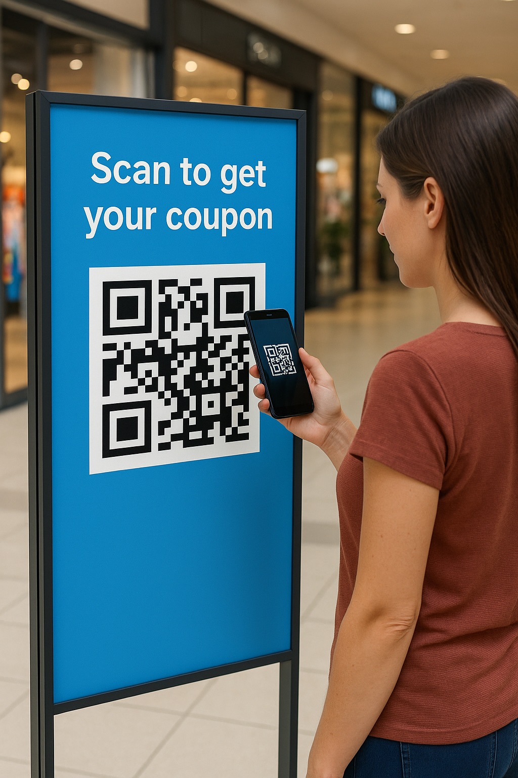 The user should easily notice the code and be able to raise their smartphone to scan it physically. Here are some recommendations for placement:
- Eye level: On posters, stands, and signs, it is advisable to place the code approximately at the level of an average person’s height (≈150-160 cm from the floor). Then passersby will not have to crouch or raise their phone above their head. On tables (menus, signs) on the upper half, so that a seated person can see the code. For large banners and billboards, it is better not to place the QR code too high, ideally at the bottom, so that it is easier to scan from a distance.
- Visibility and surroundings: Make sure that nothing covers the QR code. For example, on a package, this can be a place that is not covered by a seam, cover, or other sticker. On a magazine page, the code should not be placed too close to the spine or edge of the page, where the camera may not capture it. Also, avoid “cluttering” the area around the QR. Leave a little space to draw attention to it and not merge with other design elements.
- One medium – one QR: If possible, do not put many QR codes next to each other. When there are two or more on one poster, a person may get confused about which one to scan, or the phone may mistakenly focus on the wrong code. It is better to combine information or use a dynamic QR code that leads to a multilink or a selection of options. In a pinch, spread the codes to opposite ends of the layout so that they do not “compete” for the same place.
- Explanation or context: It is useful to add a short text next to the code that explains what the user will get by scanning it. This also applies to placement. Such text will make the code more noticeable and attractive.
Example: Imagine an information poster in a museum. If the QR code leading to the audio guide is placed at the bottom of the poster in a small size, it will be easy to miss. The right solution would be to make it large enough and place it somewhere in the middle or at the bottom, but at eye level, with the inscription “Scan for audio guide”. People will notice the code and understand what to do with it. On cash receipts, on the contrary, it is better to print the QR code at the top or in the middle of the receipt, where it will not be forgotten and will not come off if the bottom part is cut off.
8. Add a Call-to-Action or Instructions
Simply printing a QR code is not a guarantee that people will use it. Add a short call to action (CTA) so that the user understands why they should scan the code. Even a simple word “Scan me” significantly increases the likelihood that a person will be interested and point the camera. Even better, be more specific: “Scan to play video”, etc. Such a prompt inspires trust (the user understands what to expect) and stimulates action.
CTA Phrases That Boost Scan Rate
| CTA Text | Engagement Rate ↑ | Best Used For |
|---|---|---|
| Scan to learn more | ✅✅ | Flyers, brochures |
| Scan to get a discount | ✅✅✅ | Retail packaging |
| Scan & win | ✅✅✅ | Promo posters, events |
| Scan for video tutorial | ✅✅ | Product instructions |
| Just scan | ✅ | Minimalist designs |
In addition to a text CTA, you can draw a frame or arrow around the QR code. Many generators allow you to insert a small camera or scanner icon in the middle of the code – this is also a good way to suggest its purpose. A key phrase or graphic element accompanying the QR code attracts attention and explains its benefit. According to research, codes with an explanatory inscription are scanned much more often than those that stand alone.
Also, make sure that the CTA is readable from the same distance as the code itself. If you expect the code to be scanned from a distance (for example, on a store window), make the inscription large enough. And, of course, the text should be truthful and correspond to what a person will receive when scanning, and should not mislead.
Example: a QR code is placed on the packaging of a new drink. Without a caption, buyers may not understand its purpose. Add a short phrase: “Scan and find out the cocktail recipe!”, and the consumer’s interest is guaranteed to increase. Another example is a museum or park: next to the QR code, make a sign “Scan for English” (for foreign tourists). People will appreciate such a hint and use the code, knowing that they will get the information they need.
Testing QR Codes Before Mass Printing
QR Code Print Testing Checklist
| Test Type | Action | Status |
|---|---|---|
| Device compatibility | Scan with iPhone and Android devices | ✅ / ❌ |
| Lighting conditions | Test in daylight and low light | ✅ / ❌ |
| Distance check | Scan from expected user distance | ✅ / ❌ |
| Material/fold test | Scan final printed version on real material | ✅ / ❌ |
| Logo/design impact | Make sure custom design doesn’t affect scanning | ✅ / ❌ |
Before you start printing thousands of labels or hundreds of posters with a QR code, be sure to test the code in real conditions. This is a critical step that will save you time, money, and reputation. Here is a plan of action for testing:
- Print a sample. Please make at least a few test copies of your QR code in the form in which it will appear on the final medium (size, color, material). It is advisable to get a real proof from a printing house or from a printer that simulates the final print run. The screen view may differ from the print, so a paper test is mandatory.
- Test with different devices. Take several smartphones with different cameras and OS (new iPhone, mid-range Android smartphone, etc.). Try scanning the code with each. Use both the standard camera (which automatically recognizes QR) and popular scanner apps. If a phone does not read, then find out why. You may need to increase the size or contrast.
- Test in different conditions. Try scanning the code in different lighting conditions: in bright sunlight, indoors, under artificial lighting, in semi-darkness. See if the gloss is not reflective, and whether the code is visible from the required distance in each condition. If it’s a poster, hang it up and move 2-3 meters away: does the camera focus? If it’s packaging, place it on a shelf like in a store and try to scan it quickly, as if you were a customer in a hurry.
- Simulate the user scenario. Think about how people will interact with the code. For example, if it’s a code on a ticket, will it be easy to remember in your pocket? If it’s on a badge, will it be covered by clothing? Try to identify these nuances before replicating.
- Make adjustments and repeat. If the test reveals problems (you have to point the camera for a long time, the code is scanned more than once, it leads to the wrong page, etc.), adjust the design or code parameters. You might want to enlarge it, change the color, or correct the URL. After making your edits, print a test copy again and see if it’s improved. Don’t be afraid to run 2-3 testing cycles—this is normal in professional practice.
Testing is a kind of guarantee. As one expert notes, you should always check the code on the final product using your usual scanners before releasing it to the world. This approach will prevent you from having to remove or reprint already printed materials because of an inaccessible QR code.
Recommended Tools to Generate QR Codes
To follow the practices mentioned above, it is worth using specialized tools for creating and verifying QR codes. They will help you generate a code in the correct format and size and add the necessary settings. Here are some recommendations:
- Online QR code generators. For professional use, choose a service that supports dynamic QR codes, allows for vector image uploads, and offers design customization. For example, the ViralQR platform allows you to create QR codes with a logo, frame, and your own design, and most importantly, dynamic codes that can be edited even after printing. You can change the target link or content without changing the code itself, and track scan statistics in real time. ViralQR provides a single interface for creating, editing, and managing all your QR codes. Files can be downloaded in SVG, PNG, EPS, and other formats, which guarantees high-quality printing. Similar services also offer scan analytics, which are useful for evaluating the effectiveness of your QR campaigns.
- Testing tools. Before printing, you can use apps on your smartphone to make sure it’s scanned. The standard iOS or Android camera will work (modern phones automatically recognize QR codes), as well as special scanners like Google Lens, QR Scanner, etc. If your QR code is non-standard (for example, colored or with a logo), try a few different apps. This will give you confidence that the majority of your audience will have no problems.
- Graphic editors and layout programs. When working with a QR code in your design, use vector editors (Adobe Illustrator, Inkscape) or PDF/SVG export functions in layout programs. This will ensure that the code does not lose quality when printed. Some QR code designers (such as ViralQR or others) allow you to immediately download a ready-made layout with a code for printing, which simplifies the process.
Using the right tools makes it easier to follow best practices. You spend less time on settings, but you get a high-quality result. QR codes that look professional and work without failures. Ultimately, the goal of all these recommendations is for your customers or users to instantly and seamlessly receive the information stored in the QR code, whether it’s a website, video, or contact information.
Frequently Asked Questions
What is the optimal resolution (DPI) for printing?
For high-quality printing of a QR code, a minimum of 300 DPI is recommended. At this resolution, small elements will be clear. If you print with a lower DPI, the edges of the modules may be blurred, and the code will become difficult to scan. Therefore, always export or generate a QR code in high quality. Most online services automatically provide sufficient resolution for printing, but it doesn’t hurt to check.
Is it possible to print a QR code in a color other than black?
Yes, you can use different colors, but be sure to observe the contrast. The main rule is a dark code on a light background. For example, a dark blue or dark green code on a white background will scan almost as well as a black one. On the other hand, a light (yellow, pale gray) QR code on a dark background may not be read by some scanners. Although modern phones have learned to read inverted codes (light on dark), many scanners in public places or older models may not be able to do this. Therefore, for guaranteed compatibility, it is best to stick to the classic scheme: dark squares on a light background. And a color accent can be made in the design of the frame or by adding a logo – this will not interfere with reading if the pattern itself is contrasting.
What is the minimum size of a QR code on printed media?
According to the ISO 18004 standard, the theoretical minimum size of a QR code is about 1 × 1 cm (for the simplest version 1 code). However, in practice, such a small code is often not scanned the first time. Experts recommend a size of at least 2 × 2 cm (about 0.8 inches) for any printed material. This size ensures that most smartphones will be able to distinguish elements even with a mediocre camera. If the code contains more data (many small modules), it should be expanded. Consider the distance from which you will be scanning: 2 cm is enough for a business card, 5-10 cm may be needed for a poster, and tens of centimeters for a billboard. It is better to be safe and give a slightly larger size than the minimum possible.
What file format is best for printing a QR code?
It is best to use vector formats – such as SVG, EPS, or PDF. A vector file provides perfect clarity at any scale, which is especially important for large posters or banners. If you do not have the opportunity to get a vector, then use a high-resolution PNG (for example, 300 dpi and higher, with a margin of pixels). JPEG formats are not very desirable, because they use lossy compression – small JPEG artifacts can interfere with scanning. Many services (including ViralQR) provide the option to download the code immediately in SVG/PNG. Be sure to check that when inserting it into the design, the image size corresponds to 100% (without scaling up). This way, when printing, you will get the clearest QR code possible without the risk of pixelation or blurring of details.
Do you need to leave a white field around the QR code if it is on a white background?
Yes, a quiet zone is necessary in any case, even if the background is already white. The thing is that the scanning algorithm needs to “know” where the boundaries of the code are. If, say, your QR code is printed in black on a pure white poster, it is still worth leaving at least 4-module (or ~5 mm) of space around it without text or images. This ensures that nothing accidentally ends up too close. In printing processes, there are allowances for cropping, ink displacement – a quiet zone ensures that even with a small shift, the code does not “crawl” on neighboring elements. So the rule is simple: regardless of the design, leave enough empty space around the QR code. This is not only a technical requirement, but also visually makes the code more noticeable.
Final Thoughts
We hope these tips will help you effectively integrate QR codes into your physical materials. A properly printed QR code can significantly increase audience engagement: people will more conveniently navigate to your website, get additional information, or perform a targeted action. Follow these best practices, and your QR codes will always work perfectly. They will be easy to scan, look professional, and bring the expected benefits to both you and your customers.